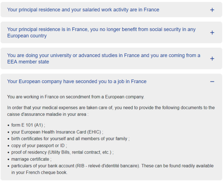
Accordions
Summary
Principle

Accordions are dynamic components that optimize the display of content in a limited space with expand/collapse mechanisms on the panels.
They are usually controlled by a button which toggles the content of each panel in and out of view.
This code is based on the “Accordion” design pattern found in the ARIA Authoring Practices Guide (APG) of the W3C.
The source code and implementation examples for this component are available in this guide.
Core HTML base
ARIA roles, states and properties
- Each accordion header must be marked up with
<button>. - Each accordion header must be surrounded by a header tag (
<h1>to<h6>), depending on the context in which the accordion is placed. - The
aria-expandedattribute must be added to each accordion header. Its value will be set dynamically based on the state of the accordion:aria-expanded="true"when the associated panel is open.aria-expanded="false"when the associated panel is closed.
- Each accordion header must be attached to its panel by means of the
aria-controlsattribute:- Each panel must have an
idattribute set to a unique value. - Each accordion header must have an
aria-controlsattribute set to the value of theidattribute of the associated panel.
- Each panel must have an
Keyboard interactions
Enter or Spacebar
- If the keyboard focus is on the accordion header of a closed panel, one of these keys opens the associated panel. If the accordion authorizes the expansion of only one panel at the time, and if another panel is already open, it closes the panel.
- If the keyboard focus is on the accordion header of an open panel, one of these keys closes the associated panel if the accordion authorizes the collapse of that panel. Some accordions only allow one panel to be expanded at any time. In that case, the open panel cannot be closed by activating its associated accordion heading.
Note
In the HTML code example, heading level 2 (<h2>) is used to mark up the accordion headers. The heading level must be adapted to the context of the page: it is important to maintain a logical heading hierarchy in the page.
For instance, if an <h2> heading introduces the accordion, then each accordion header becomes a child of this level 2 heading and must be marked up with <h3>.
Comments
Leave a Reply
Updates
- 08 October 2025
- Minor changes.
